BRAND IDENTITY – UX / UI – WEBSITE
MAKE THE ROUNDS
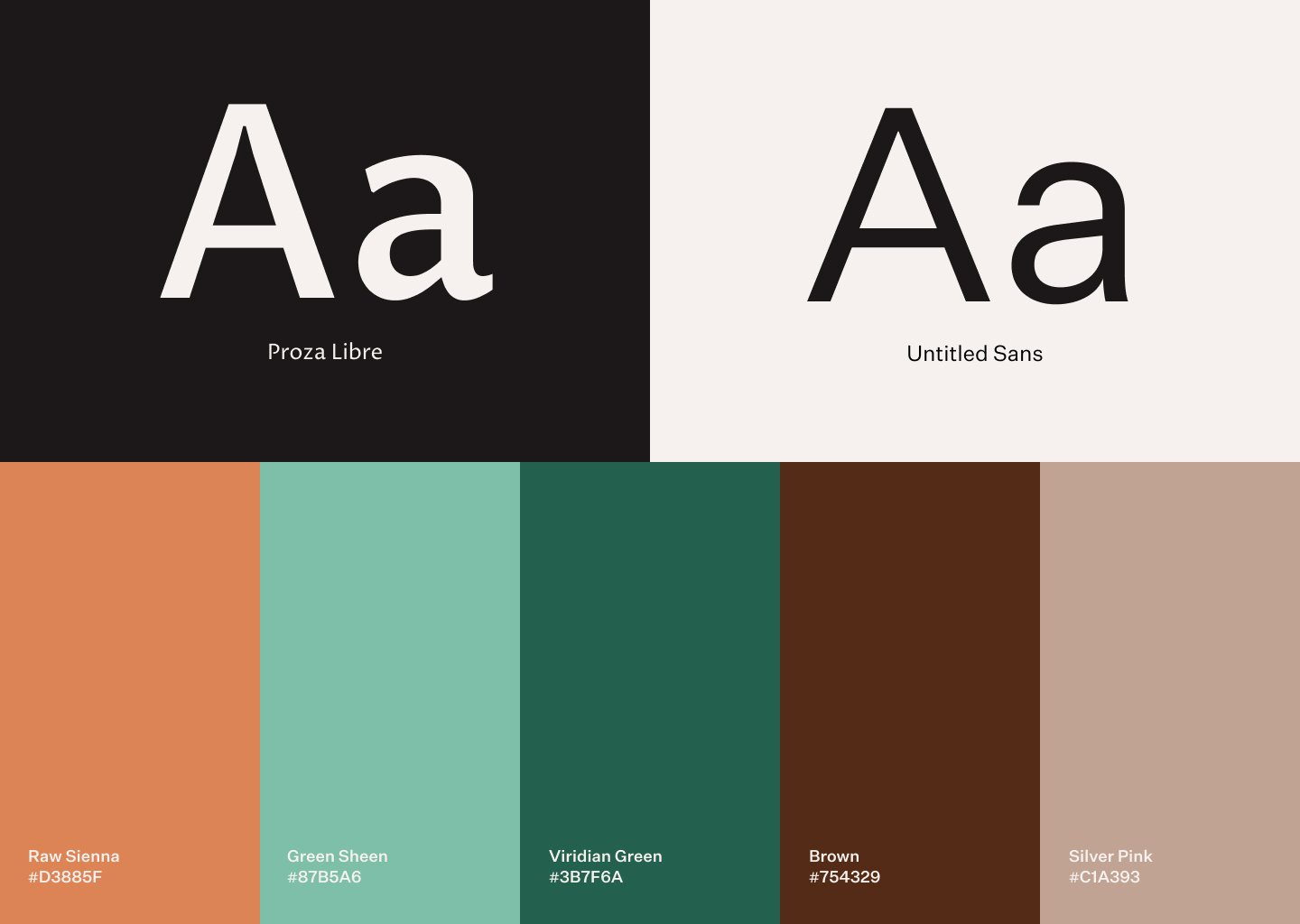
Make the Rounds is dedicated to bringing a culture of reusing and recycling to everyday living. It represents the utilitarian mindset with an innovative twist, that encourages bringing your own reusable containers for eating out. Keeping it as simple and minimal as the concept behind the brand entails, the teal and white combination represents the sense of purpose and utility of the solutions it generates. Grey brings out the cheery teal and represents the dedicated passion to create sustainable lifestyles. Imagery of trees and plantation underscore the eco-friendly nature of the brand. Whereas, a dash of some subtle colors help break the monotony and highlight the social cause that inspired the brand.


