BRAND IDENTITY – UX / UI – WEBSITE
LUMBER
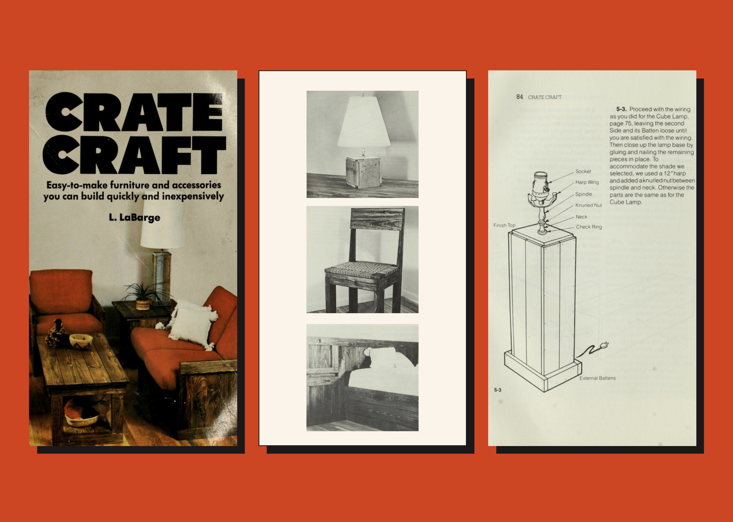
In a world rife with information and sensory overload, Lumber inspires simplicity accentuated by class. It is a brand that advocates ingenuity and approachability, with an intense old world charm to it. The brand tone is friendly yet sophisticated to convince the audiences of the authenticity as well as the utility of the tutorials they create. The vermillion is underscored by the pristine spaces set in earthy tones. It symbolises the sense of accomplishment that users experience, once they build inexpensive wooden furniture with their own hands. Wood is an important element of the brand identity and the images of raw furniture help create a connection with nature and creativity. The exciting yet gratifying journey of self learning and creating something useful out of scrapes is the real essence of Lumber.


