Brand Identity – Packaging DesignHARINA STUDIO
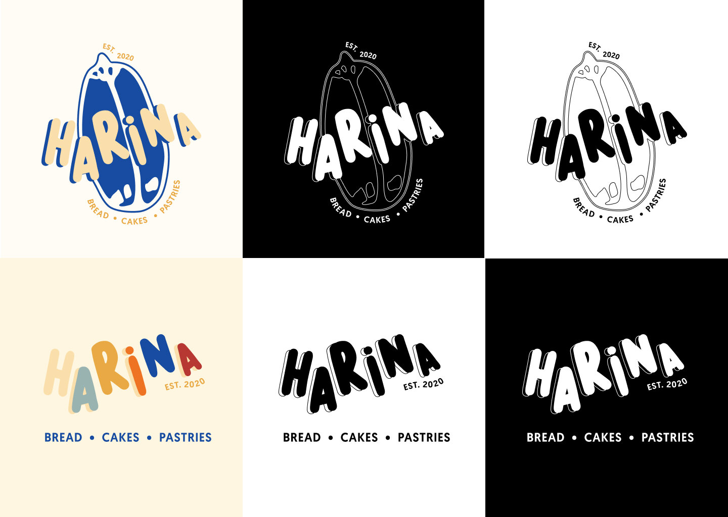
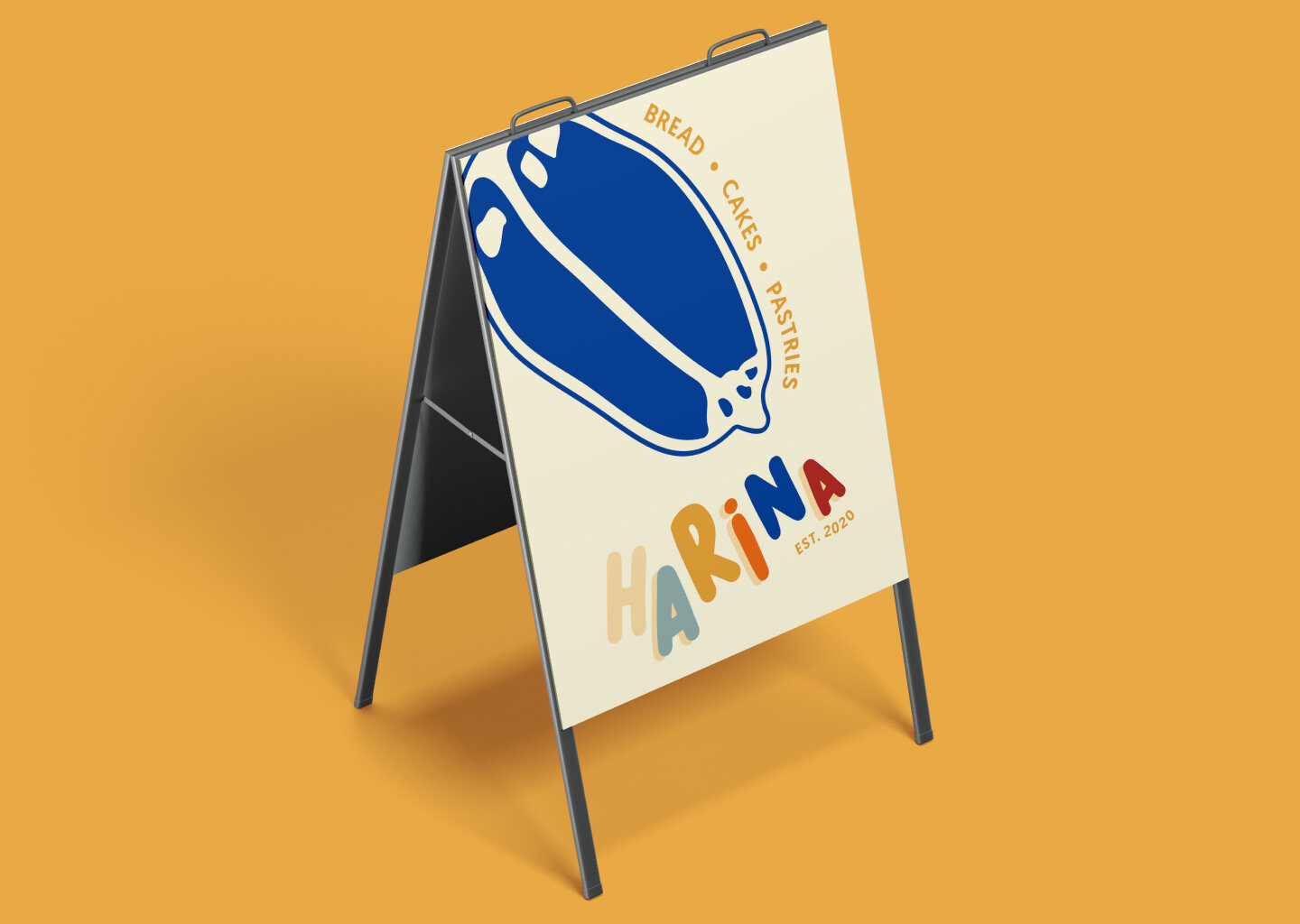
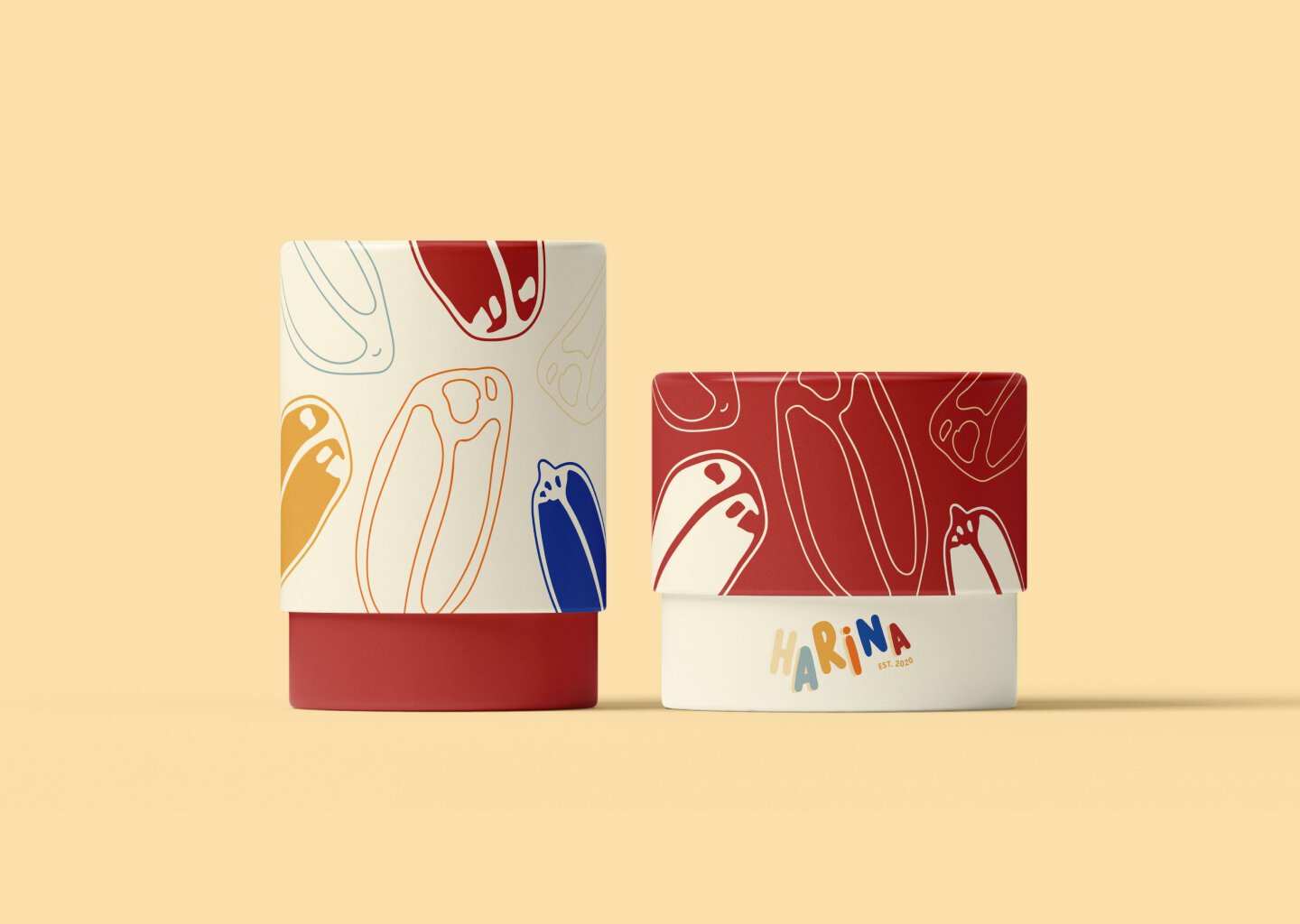
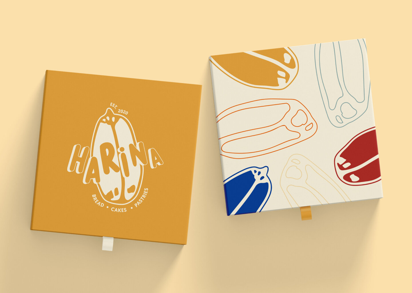
In Tagalog, a native language of the Philippines, “arina” means “flour”. It comes from the Spanish, “harina”. Harina Studio, then, is the perfect name for a Manilan bakery that breaks bread with the past and the future.
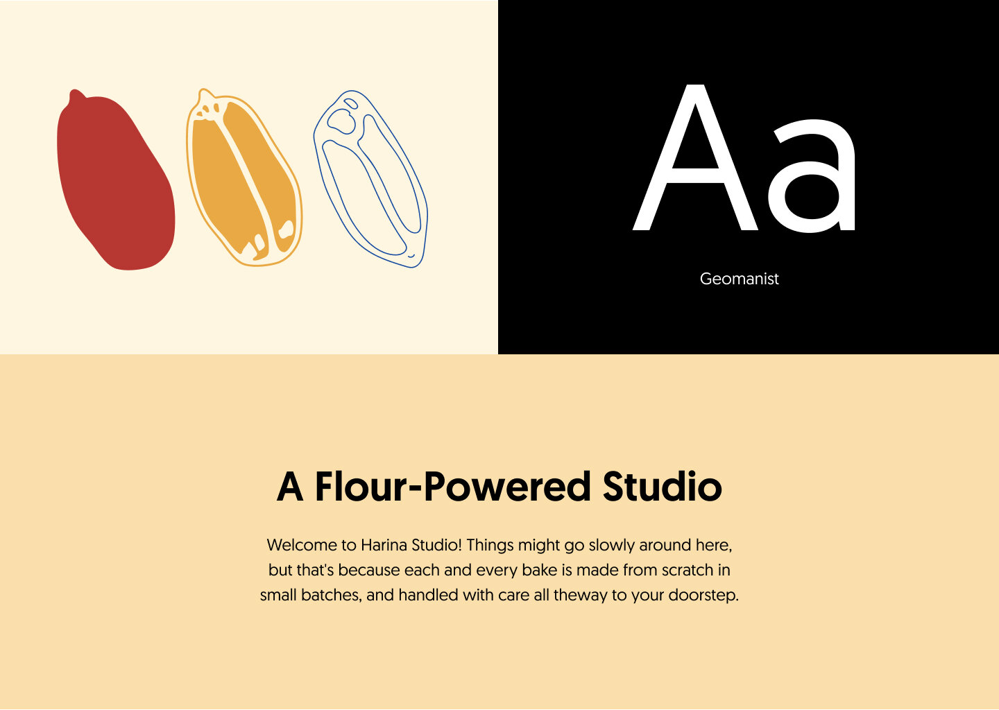
The design uses Art Deco to mirror this desire. The type face is traditional but timeless. It has class in its simplicity and adds a vintage feel to the branding.
Vintage is a word often mis-understood. It does not mean merely old, but high-quality, the peak of creative genius at any one time. With age, a vintage wine gets better, a vintage coat more coveted and a vintage car more fun.
Harina Studio mixes old-town style with modern creative genius to strive for timeless brilliance. They look to get better with age, for their bread to be more coveted and to have more fun as time goes on.
Email to request Brand Guidelines
