Brand Identity – Packaging DesignWALLOP BEER
As the popularity of craft beers continues to accelerate, competing aesthetics have emerged: the two most common styles are spartan, logo-forward, sans-serif minimalism and over-the-top, colorful displays of tongue-in-cheek humor.
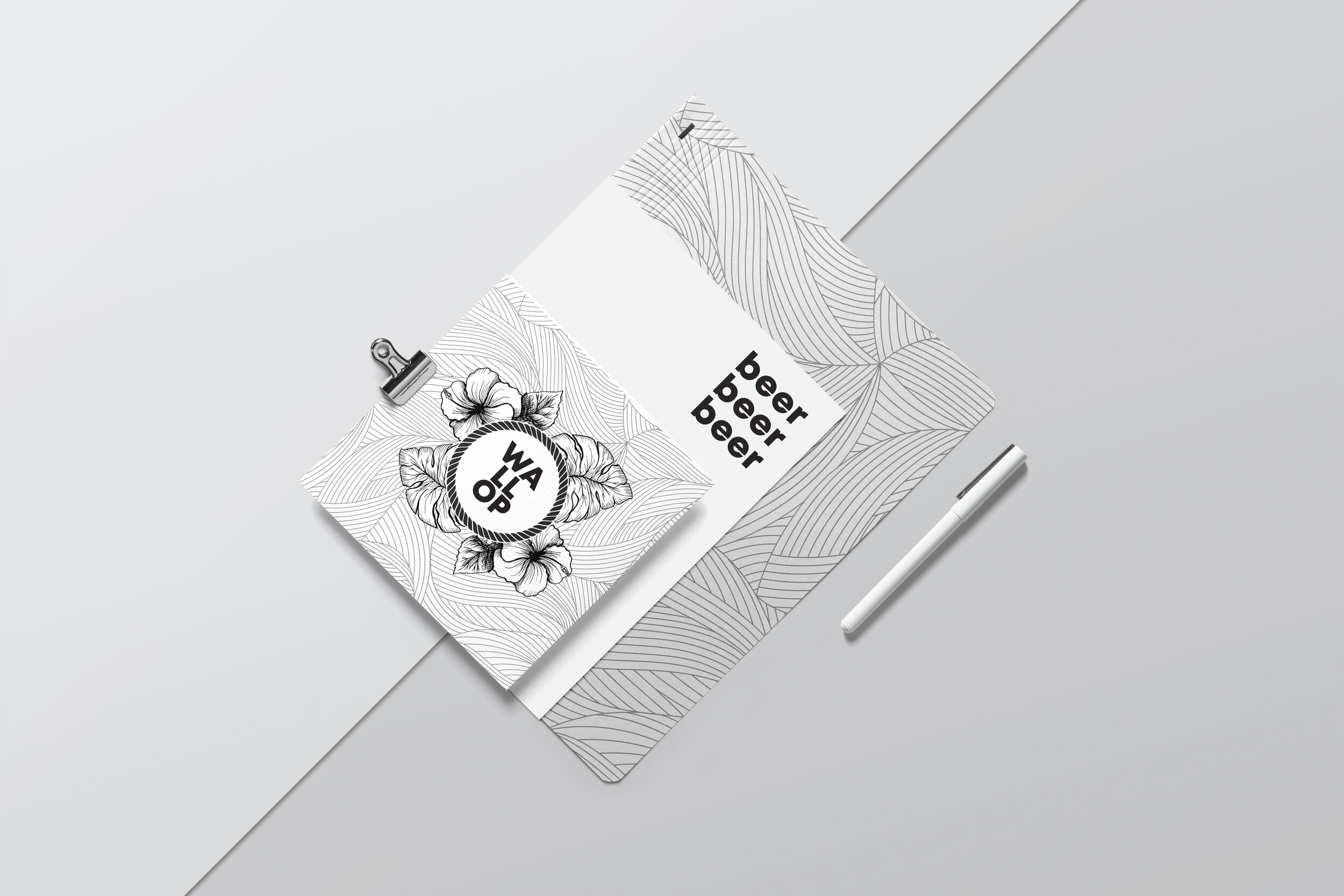
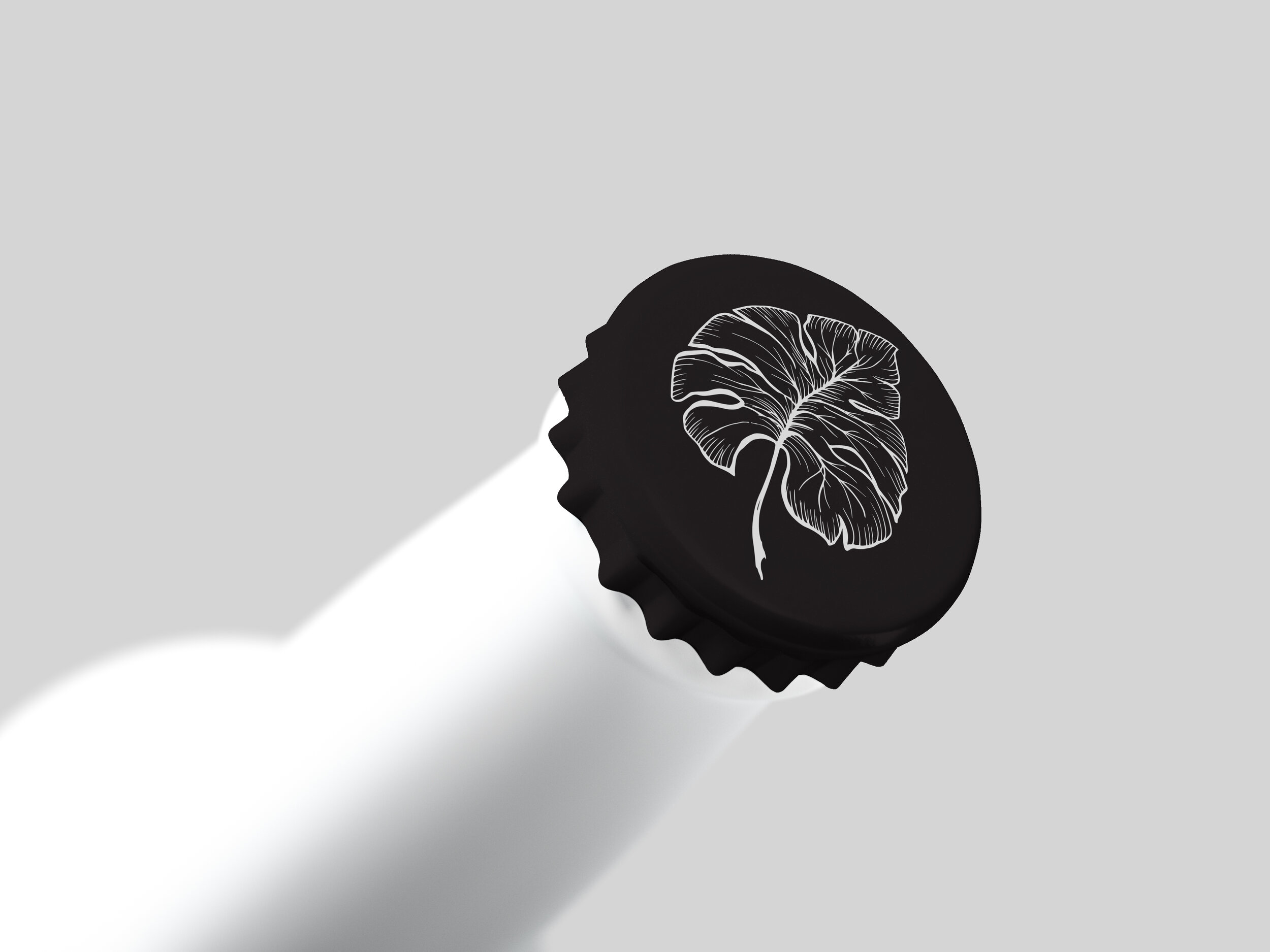
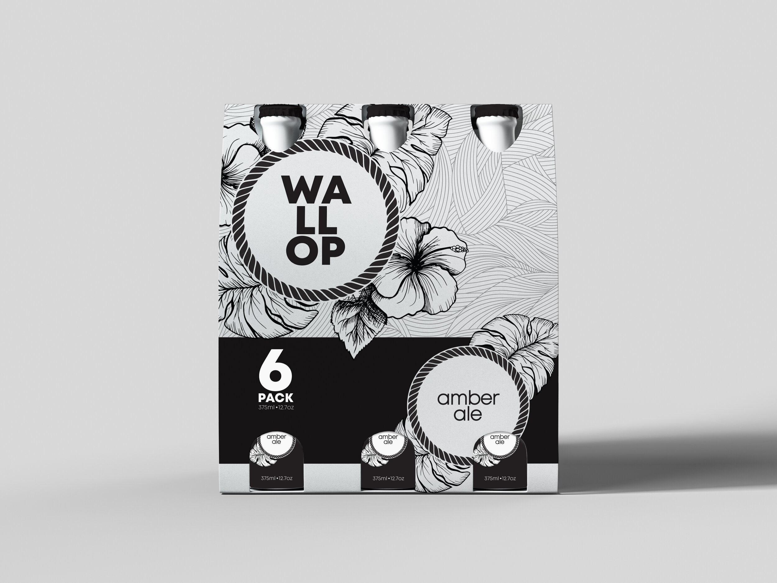
The goal with Wallop was to maintain a certain degree of approachability while evoking the creative science of craft beer brewing. Making Wallop boring and intimidating is definitely not a good idea. Thus, the best design that would fit the Wallop brand is a balance in the contrast between a simple bold sans-serif logo and unpretentious geometric illustrations prominently featuring figurative, natural elements.


